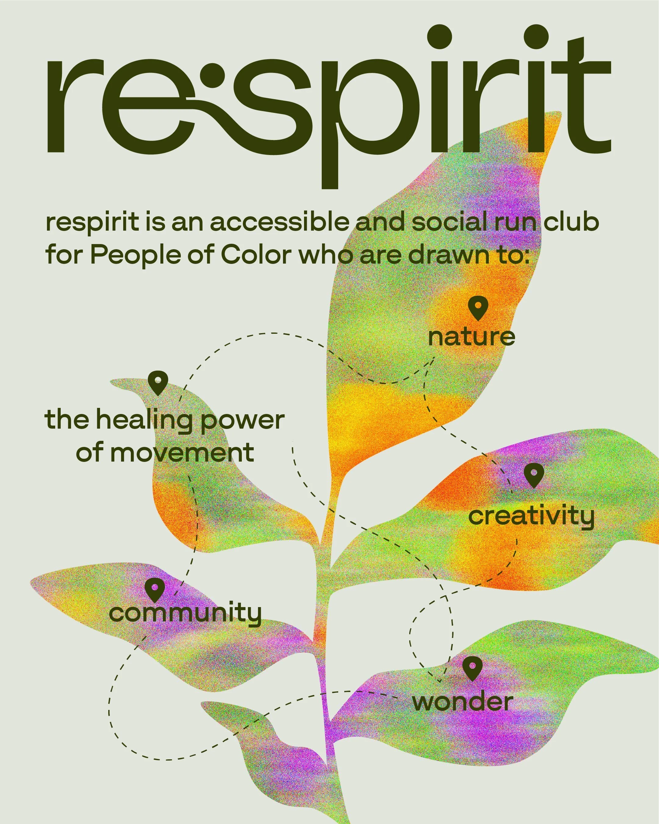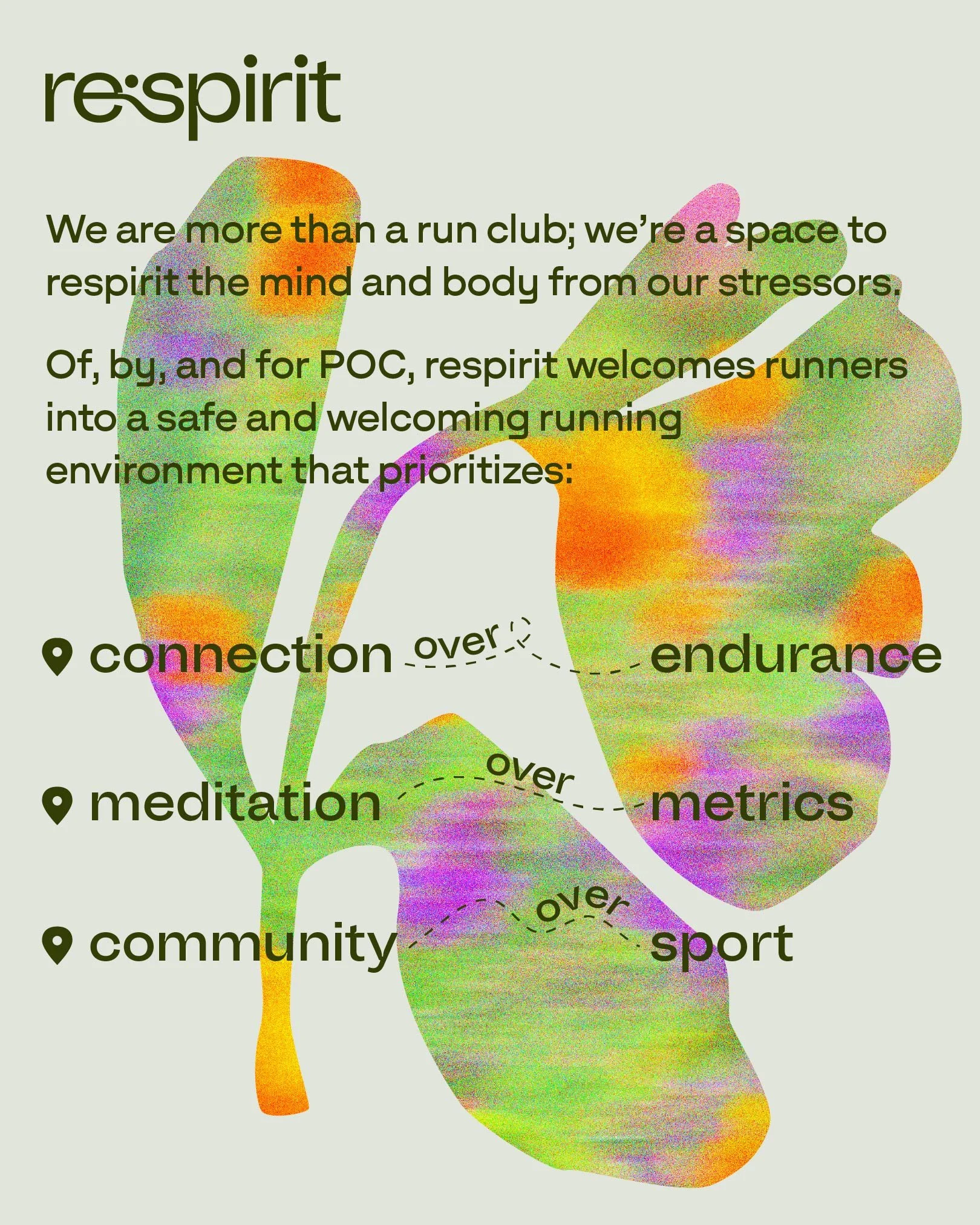
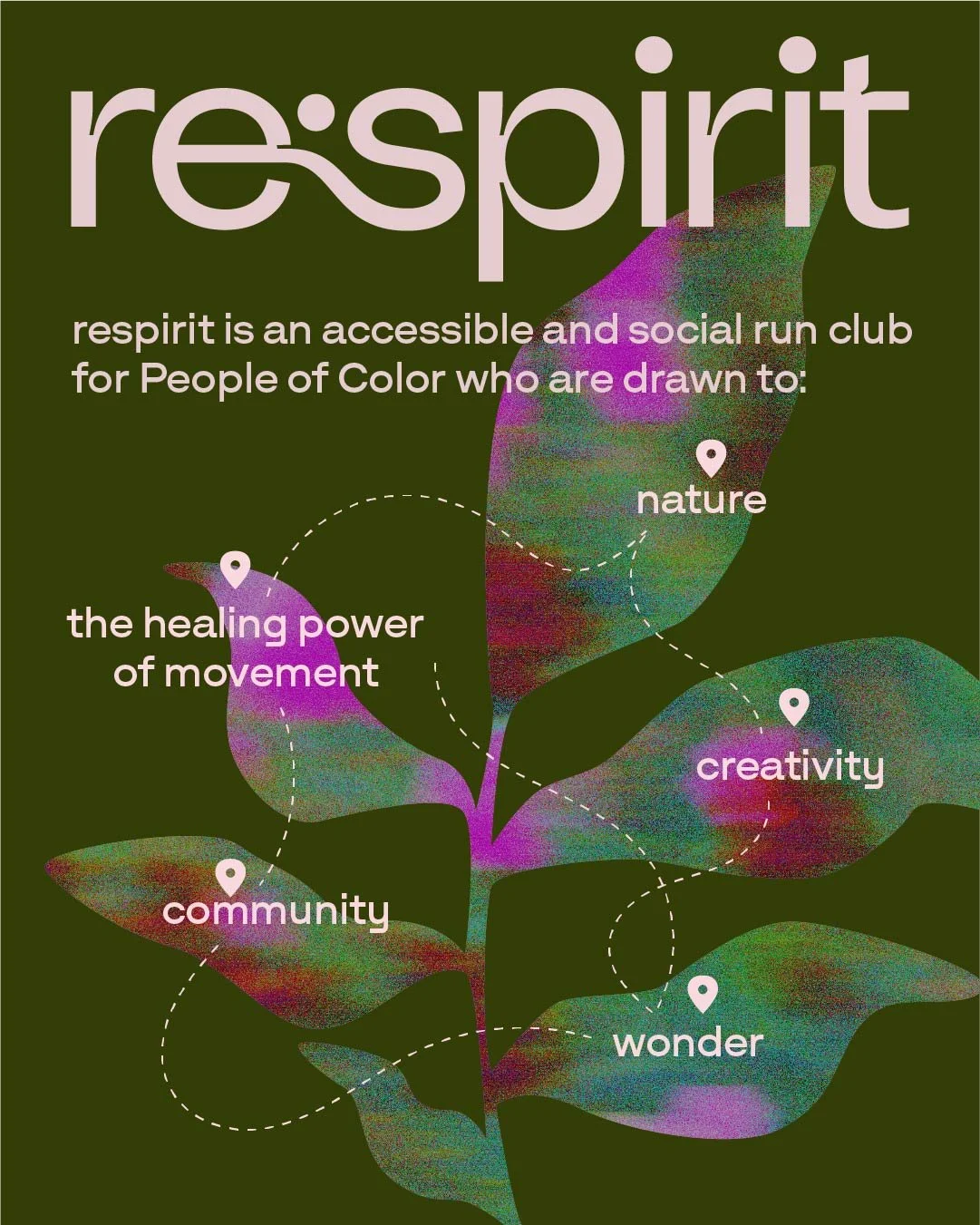
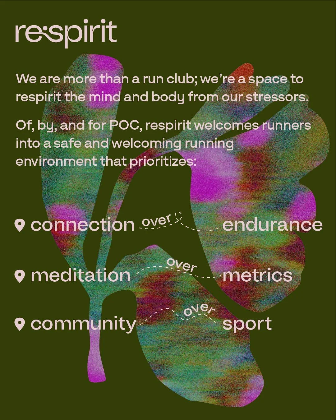
Brand Identity
Respirit is more than a traditional run club. It’s a space to respirit the mind and body that prioritizes connection over endurance, meditation over metrics, and community over sport. The branding captures the healing power of movement and the spiritual benefits of running in nature. Minimalist and mature, yet joyful and whimsical at the same time, the visual identity conveys that respirit is serious in intention and playful in activity.
Respirit
2025
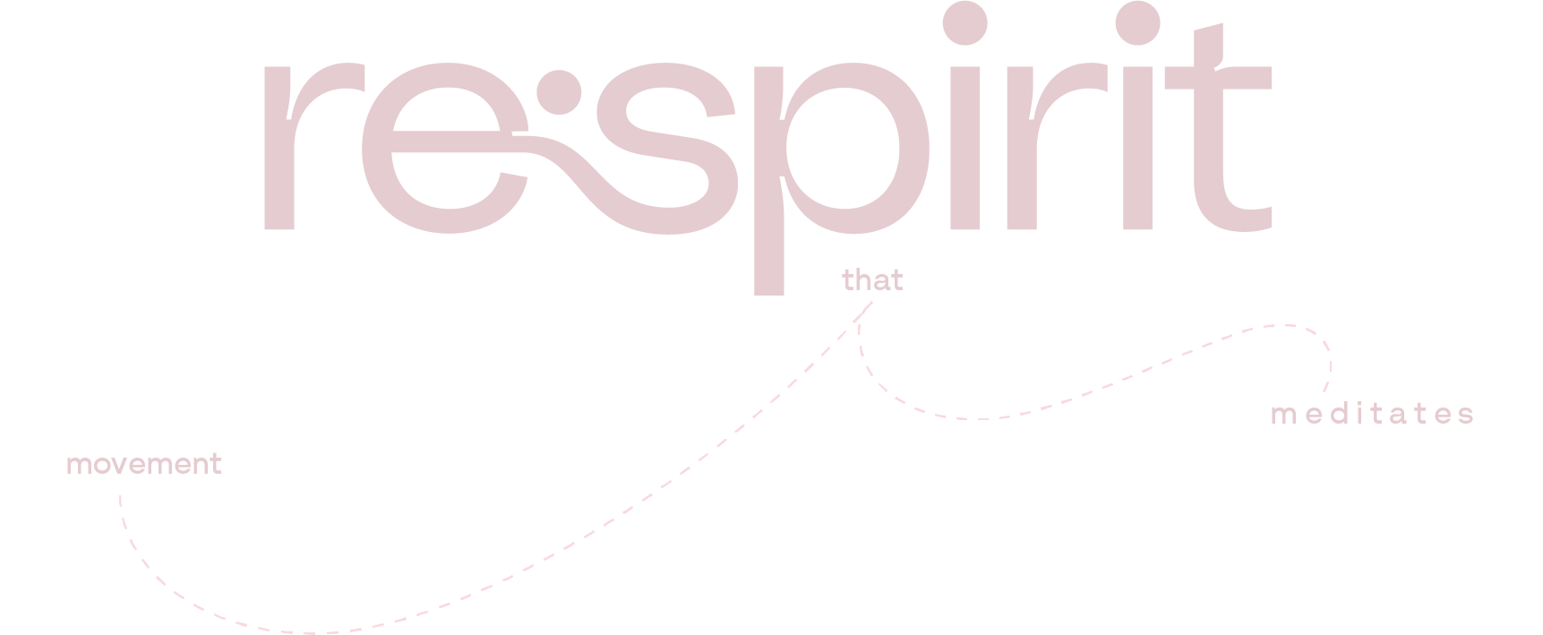
01 Logo and Social Media
Respirit’s logo evokes movement and balance at the same time. It was designed with the natural landscape and winding trails of San Francisco in mind.
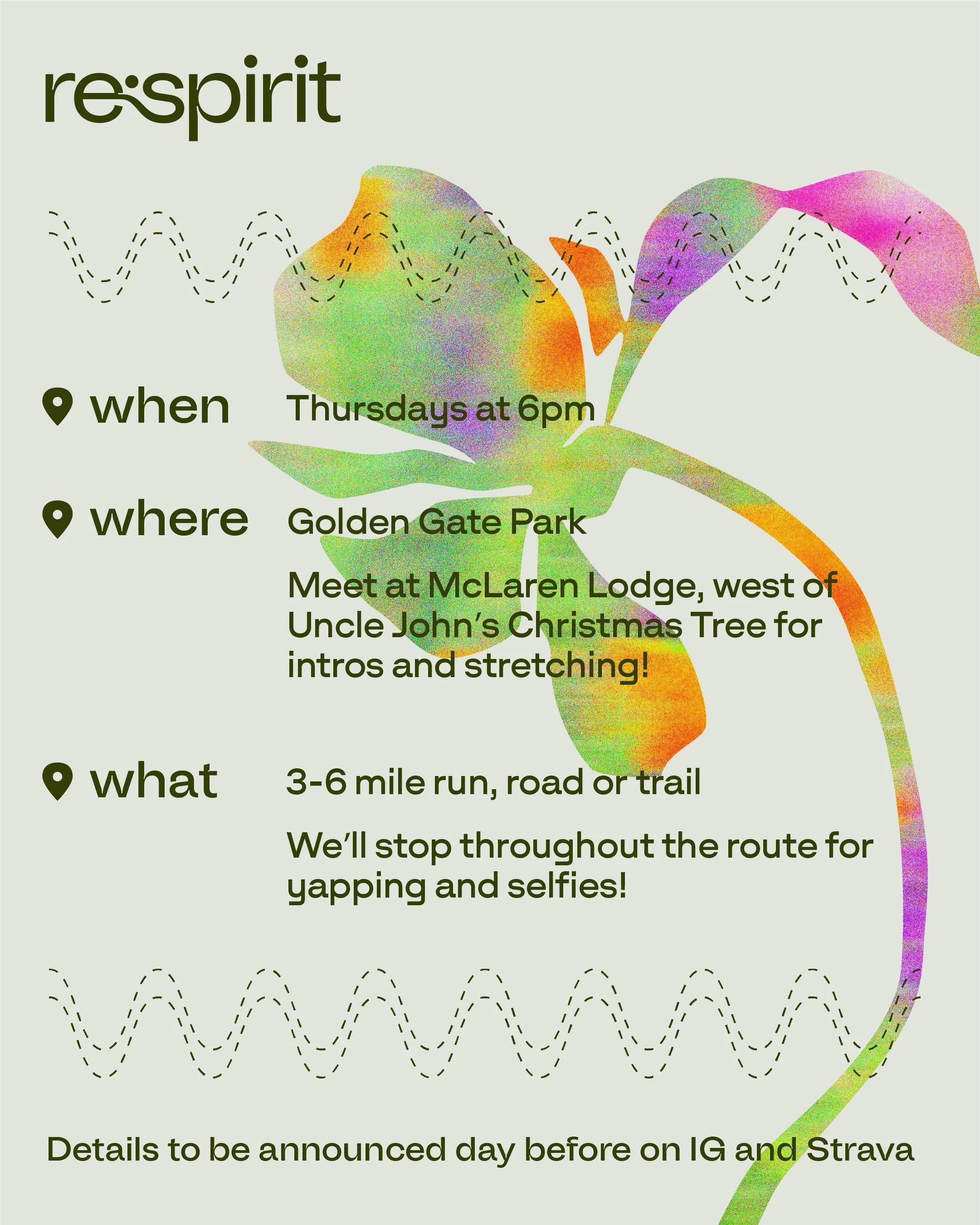
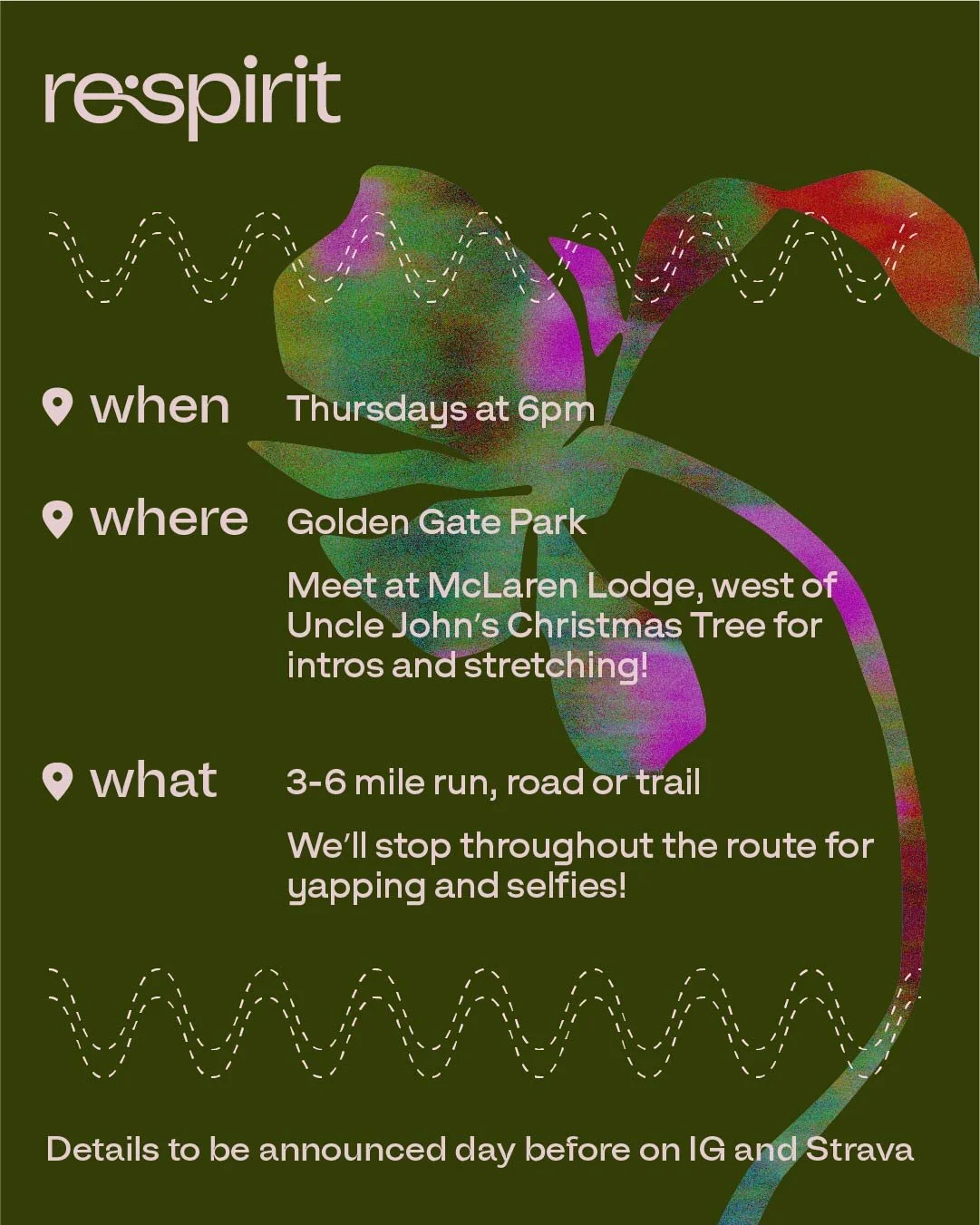
The social graphics convey respirit’s mission playfully and dynamically, ensuring that the message isn’t stifled by superfluous text.

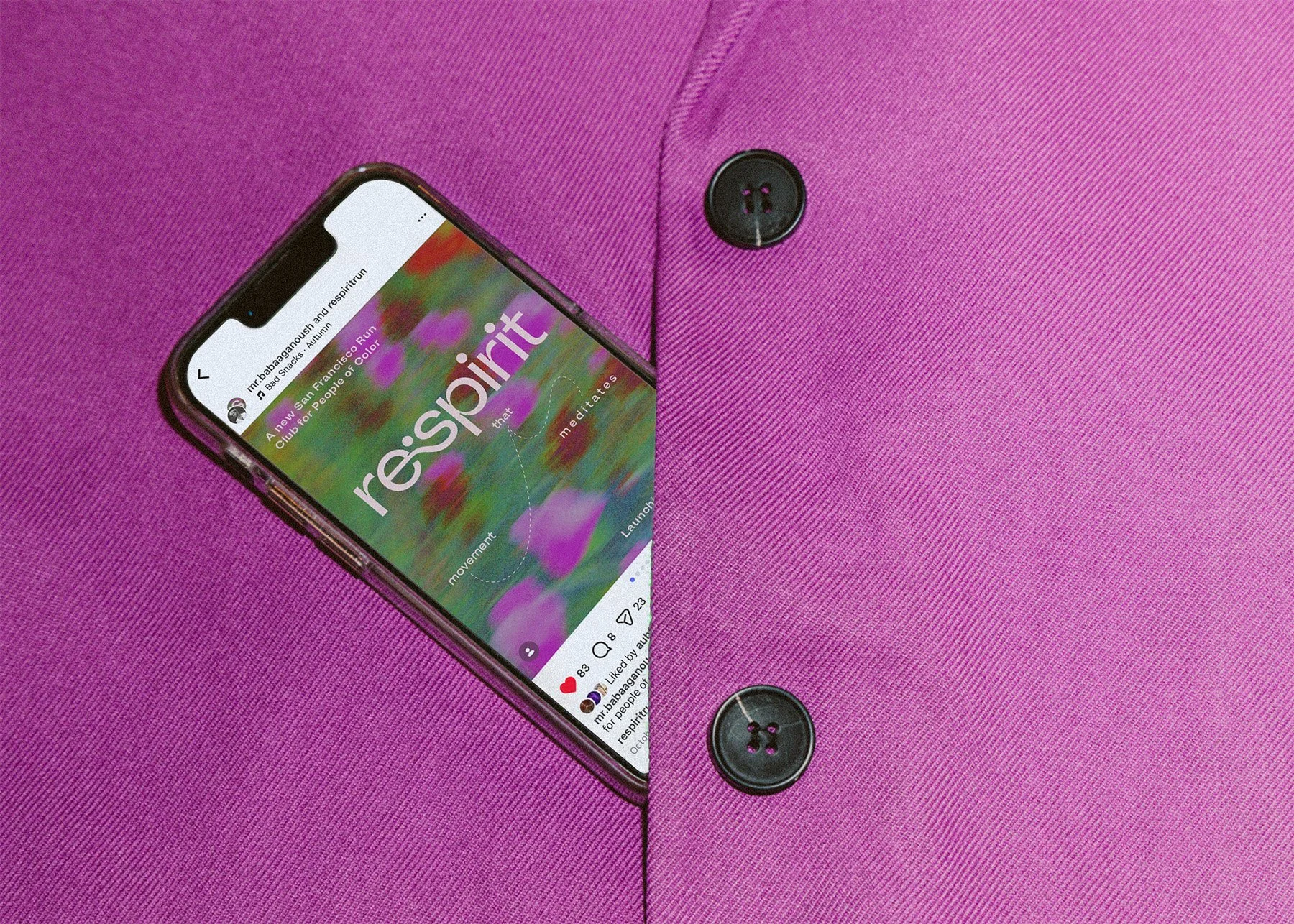
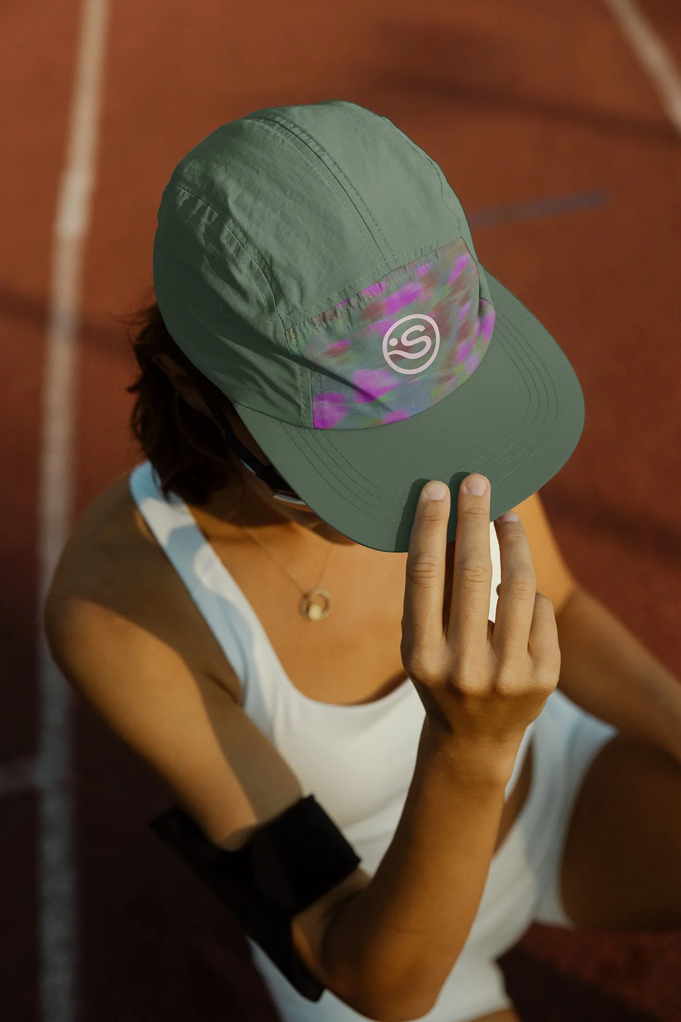
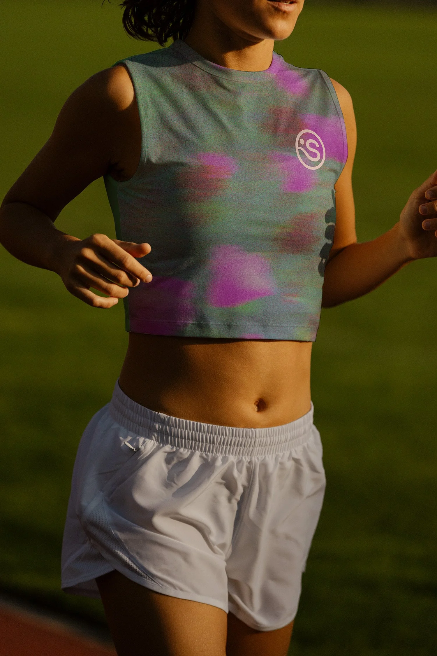
02 Logomark and Apparel
The apparel features a logomark that captures the whimsical minimalism of the brand.

03 Daytime Color Palette
The alternative daytime color palette, inspired by golden Californian poppies, can be used to highlight morning or daytime runs, as opposed to sunset or evening runs. It can also be used to signal a change in season from fall/winter to spring/summer.